Walmart One App
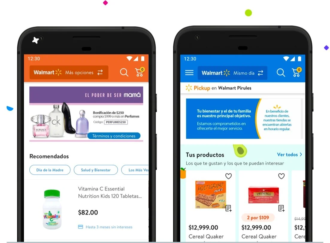
Mexico market had two different platforms: on-demand(OD), where users could place same-day orders from their nearest physical store, and an extended assortment(EA) shop for thousands of items available exclusively online from fulfillment centers and marketplace.
The Challenge
Provide tools to customers to access more products and fulfillment options in a single app.
Plus: Short timelines and technical constraints: the backend didn’t have capabilities for a combined catalog, so we needed to have two different browsing experiences and two carts.
The Discovery
We initiated this project by asking users if they were aware of Walmart's two platforms (EA and OD); they didn’t know about them nor find any value on the EA platform since they knew they could get everything in their nearest Walmart store. Although when asking them to find items such as “milk” in the EA platform or “furniture” on their nearest store, they would see few results or nothing.
In conclusion, users didn’t know there were “Two Walmarts,” nor were they keen to download two apps to an online shop.
Since we couldn’t show both catalogs on a single page, we needed to provide a way to browse more options.
The Process
Solutions
Since we couldn’t show both catalogs on a single page, we needed to provide a way to browse more options.
Header Unification
Unify the experience on Web as well as Android and iOS Apps
We wanted to have one platform to provide visibility for both experiences. We came up with tabs on the web version, so users who use either Online or nearest store site would be aware of the other option.
On apps, the user would switch from one store to another through the header, navigation, and overall structure remained the same.
Both platforms had different design systems, but the On-demand app had more active users and overall more revenue; we decided to implement its design system and unify the styles to match it(iconography, components, buttons, etc.). As for colors, each had a particular color(Blue and orange), so we kept that to provide context.
Contextual onboarding
As we introduced a new experience to users, we needed to provide awareness, so coaching tooltips were added the first time the users would land on the re-designed site. And for apps, we included new onboarding and coaching tips to generate awareness of the switching on the header.
Search results visibility
Increase discoverability of repurchase features
Our main goal was to be able to show the users the catalog of both platforms, so we introduced an intelligent search: when the users would find certain items that were exclusive from the other site, we would redirect them, and when they’d search for common assortments we’ll prompt them to explore to other the other site with the help of banners that would work as hallways.
The Designs


The Results
With just 50% of app users and 50% of web users are in the experiment, the initial results are a 12% increase in revenue per session on the web and a 1% increase in Add to cart rate on native apps.
The Team
It was a cross-discipline team: researcher, content strategist, PM, and engineering, whom we had to closely collaborate with to design with technical limitations in mind and ensure accurate implementation
Next Steps
The vision is to show a single search results page with items from all catalogs and filters for store/fulfillment type—additionally, a single cart view with multiple fulfillment options.
This project was only the beginning of the journey to create a seamless mobile experience for our customers. The team is looking forward to genuinely unifying the E2E customer journey not only for Walmart stores but including other stores of the Walmart Family as well. First, we need to increase our technology and logistic capabilities to provide the best experience.


